Portland landing page design makes all the difference for both local and non-local web traffic, online branding, and conversions. Why do many businesses need design and development experts to help them develop effective landing pages? Because they can be deceptively difficult to get just right. Portland graphic design services are essential to most businesses.
Many online businesses offer similar services and products, often to the same or similar target audiences. The only way to be successful in this new era of e-commerce is to stand out from your competitors in a meaningful way. A landing page that offers exclusive deals or useful information is one way to stand out and ingratiate your brand with your target audience. Landing pages can be essential for establishing your company’s brand identity since you’re offering your potential customers things they can’t get anywhere else.
What makes a landing page effective? Here are the elements of landing pages that convert:
What Makes a Portland Landing Page Design Effective?
Keep it Simple
The first element in effective Portland landing page design is simplicity. Customers don’t want to read your life story or a long list of reasons why your company is the best when they visit a landing page. They’re there to get what you’re offering to them. Many landing pages offer document downloads that give them information about the company or the company’s products. Others give customers special deals or discounts. Whatever you do, don’t delay gratification for your customers. Make it easy to get what they came for as quickly as possible. Keep your sentences short and to the point.
Simplicity also applies to landing page navigation as well. Customers shouldn’t have to scroll or click through endless pages or confusing design to get what they want. Don’t put too much information “below the fold.” Any information or copy that the customer has to scroll to read should be supplementary and non-essential to what you’re offering.
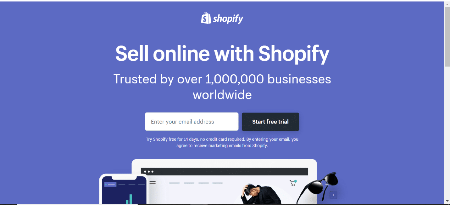
In the example below from Shopify, you can see the simplicity of the landing page:
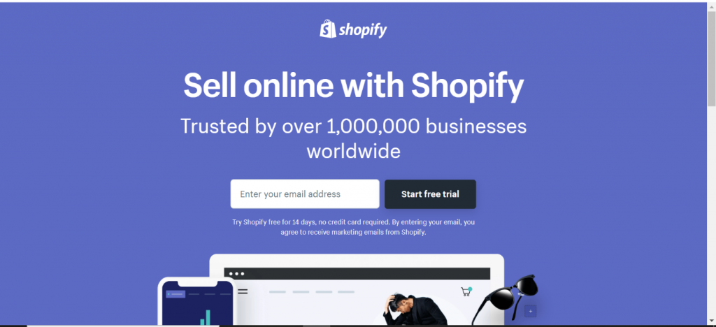 Notice the call to action is the header, just under the standard Shopify logo. The subheading, “Trusted by over 1,000,000 businesses worldwide,” addresses a common pain point in Shopify’s target audience. It anticipates the concern their customers might have over the security of the platform.
If you scroll down, you’ll find pricing information and a few of Shopify’s most salient features, as well as a list of companies who use the platform, and a testimonial from a successful client. If customers want a bit more information, they can scroll past the flashing picture in the middle, but the sign-up button and email field are right on top.
An Engaging Offer
Your Portland landing page design might be flawless, but if you’re offering something no one wants, you can’t expect any engagement or conversions. Customers will only respond to offers that help them. Personalized coupons, whitepapers, research, free trials, and email lists are the most common things customers would find useful, depending on your target audience and sector. For example, if you offer complex software platforms to customers, you may want to offer them an informational sheet on your product to educate your customer base.
Once you have something useful to offer, you have to make it attractive. On the button, customers press to get your offer, write something other than the standard ‘submit’ customers find on healthcare sign up pages. Instead, write something that urges your customers to click because the offer is too good to pass up, like “Yes, I want to claim my free PDF!” Notice that the Shopify landing page above has “Start free trial” on its opt-in button.
The point of writing something more engaging than “Submit” on your opt-in button is to visually draw your visitors’ attention to the button itself. In addition to writing something interesting on it, you can use contrasting colors or arrows and animation to draw the eye. When your call to action is on the button itself, you’re literally drawing your customers’ eyes to what you want them to do.
The following example is from Nauto, a small business software platform designed to manage fleets of company vehicles:
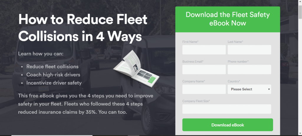 The copy is direct, with three neat bullet points highlighting what you will learn by downloading the e-book. There is a clear paragraph that concisely explains what’s in the e-book and why it’s valuable. The ‘submit’ button says, “Download e-book.” There’s no ambiguity in what the landing page visitor is getting, and the download form is clearly differentiated from the rest of the text and the background with contrasting (but not ugly) colors.
Another trap that many who seek Portland landing page design experts fall into is ignoring their Pay-Per-Click ad messages. Put yourself in your customers’ shoes. When they click on a banner ad that reads, “Download the free e-book!” they expect a consistent message when they come to your landing page. Conversions always suffer greatly if your landing page messaging doesn’t match your PPC ads. If your banner ads offer an e-book, don’t write “Get the report,” or “Download the .PDF” on your landing page. This will confuse your customers and turn them off.
Help the Customer Get the Important Facts Quickly
Attention span is everything, as you know from rehearsing your elevator pitch a thousand times. Customers don’t come to your landing page to learn about your company. They’re there to learn about your offer. If the customer can’t figure out what exactly you’re giving them on your landing page in two seconds, you’ve lost them.
The two landing page examples above illustrate excellent directness and simplicity, but here’s another great example of getting to the point quickly from online chatbot developer Landbot:
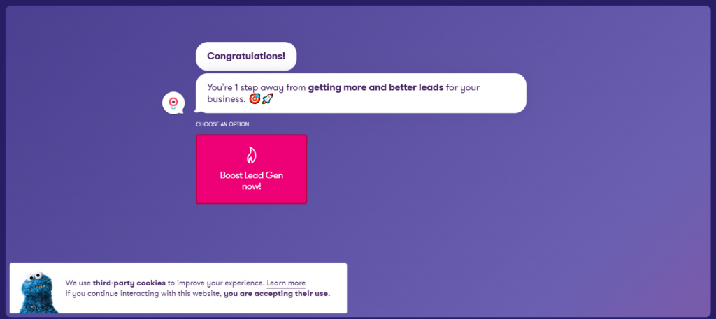 This is an ultra-clever, ultra-simple landing page design that explains the value of its offer in one simple sentence. Now, you might notice that you don’t know exactly what this landing page is offering. But if you click on the attractive, stand-out “Boost Lead Gen now!” button, you’ll find out exactly what the offer is. The point of this landing page, however, is clear: it exists to give visitors more and better leads for their businesses. If you click on the button, you’re not signing your life away or making any commitment, you’re simply learning more about how Landbot can improve your conversions.
Portland landing page design experts love interactive landing pages like this because they keep visitors engaged while leading them to the resources they need.
One crucial piece to building an engaging landing page is using client-centric language. We know now that simplicity is paramount. But you also have to relate to customers who come to your landing page looking for something that will help them. They don’t want more web copy about how great your company is, they want to know what you can give them right here, right now. Focus on their pain points and how your offer can solve their problems.
Getting to the important points quickly also requires some graphic design chops. You must use an intuitive visual hierarchy to draw your customers’ eyes to what you want them to read first, second, and third. Using bold letters is great (see above), but if everything is bold and gaudy, there’s no hierarchy, the eye wanders and there’s nothing worth paying attention to first.
In this example from the online flower business H. Bloom, what do you read first?
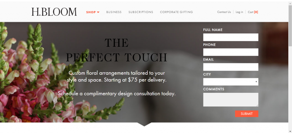 Normally, you’d be drawn to the headline, “The Perfect Touch,” but because its font blends into the background color, your eyes probably fall to the middle sentence: “Custom floral arrangements…” That is not by accident. Right away you know what you’re getting by filling in the forms to the right. The next sentence explains how you can get a custom floral arrangement: by scheduling a complimentary design consultation. This is an example of an unusual visual hierarchy, but it’s effective in getting the visitor the most important facts quickly.
Be Unique
All the aspects of your opt-in page depend on your brand. You want a simple, easy-to-use landing page design so your customers won’t get frustrated trying to get their free offer. You want to give your customers the salient facts about the offer and your brand as quickly as possible, but there is some leeway and creativity that can go into landing page design.
It might sound a bit risky, but your landing page visitors have visited about a thousand landing pages already for various offers and products. The competition to build better landing pages will only increase. Adding a bit of creativity, some razzle-dazzle to your landing page without making it too busy or confusing is where Portland landing page design experts make their money.
Let’s take a look at a hilarious and unique landing page from Muzzle:
(Warning, this screenshot may not be entirely safe for work)
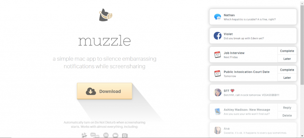 Muzzle is a service that mutes all your desktop notifications while you’re screensharing. Now Public Intoxication court date reminders won’t turn off colleagues or blow a big sale. This landing page gives visitors a chuckle by showing them all the excruciatingly embarrassing notifications that could come up at inopportune times. The value proposition for the app is easily understood in one short sentence, with only a download button against a white screen. Instantly, visitors know what Muzzle is and how to get the app upon visiting this page. But they may want to linger on the page a bit more to see all the other funny notifications. The landing page itself provides value to the visitor, leaving a positive emotion lingering in the visitors’ minds about the brand providing this useful service and funny landing page.
Being unique doesn’t mean designing purposefully weird landing pages that just confuse visitors. Notice how simple the design of Muzzle’s landing page is, even with text appearing and disappearing at the right. Being unique doesn’t mean you get to flout the rules of visual hierarchy and making the download button appealing, etc. It only means there are an infinite number of ways to be of service to your landing page visitors and make your brand stand out amongst all the rest.
Make Your Brand Stand Out and Give Your Customers What They Want
Why should customers come to your online brand over your similar competitors? What differentiates your brand? Your landing page should add to this brand differentiation by offering something useful and unique. The landing page can be a way to help explain how the offer itself and, by extension, your products, services, and brand, can help the customer. You might need to add a few sentences explaining how your offer can help them on your landing page, but usually, the free offers and discounts sell themselves. Being useful in this way sets your business up for future conversions.
Online branding can be broken down into several components. The most important of these branding components is the brand promise: what you’re promising to deliver to the customer if they buy your products or services. If you’re marketing a highly specialized product that only certain workers, such as coders, use, you don’t necessarily need to educate everyone in the world on how your amazing product works. You only need to explain to your target audience what they will get from your product. Sometimes, brands get bogged down trying to sell products to people who have no idea how to use them or why they would use them. Don’t doubt your customers. Understand what they understand, and find a way to add your brand and your products to their work. When you can show coders how your product helps with their carpal tunnel, you’ve done enough. You don’t need to explain what carpel tunnel is and how it develops to them.
The point is, your landing page is often the first interaction many of your customers will have with your brand. You only have a few seconds to convince them to stay on the page and click your landing page button. Give them the information they truly need in a neat, easy to read package, and you’ll see your engagement indicators rise.
With effective Portland landing page design, you’ll increase brand awareness and become top-of-mind with your target audience, which will lead to better sales.